One face,
drawn here.
Woodhouse has a typeface of its own. It is called Loom Display: an all-caps cut drawn from a single 84-unit stroke, the same width as one fibre in the homepage sculpture. This page is the kit: what to use, how it behaves, and what it refuses to do.
- Reviewed
- 11 November 2026
- Typeface
- Loom Display
- Colours
- Six, with six jobs
- Motion laws
- Three
- Voice rules
- Five
A house face is a small, strange claim.
It does no work. It answers no question. It is the only object in the factory that stays identical whether or not anything shipped that week — which is exactly why it is worth drawing instead of downloading.
Everything else here changes: the products, their artwork, their colours, their release notes. The face does not. It is the one place where the factory says the same thing on a bad week as on a good one.
A typeface does not make the work better. It makes it recognisable, which is a smaller claim and a truer one.
Four decisions, and then the alphabet.
Loom is not drawn letter by letter and tuned by eye. It is drawn from four decisions. Change one and you have a different typeface; keep them and you can draw a letter you have not drawn yet.
- 01One fibre
- 84 units on a 1000-unit em. Every stroke in every letter is that width, at every size, in every weight — because there is only one weight.
- 02A 700-unit cap, a 10-unit overshoot
- Flat letters stand exactly on the baseline and stop exactly at the cap line. Rounds pass it by ten units, which is what makes them look level rather than short.
- 03Superellipse, exponent 2.55
- 2 is a circle. 4 is a squircle. 2.55 sits between them: a curve that has been bent and is holding its shape. Every round form is sampled from that equation.
- 04Bevelled joints
- Where two straight strokes meet, the corner is cut flat. Nothing is sharpened into a point the drawing did not ask for. A corner here is fabricated, not grown.
Why 2.55? Because 2 is a circle and 4 is a squircle, and the loom's silhouette sits between them. It was chosen by eye against the sculpture, then kept everywhere. It is a drawing decision, not a measurement of anything.
Set it large, set it once.
Loom is a display face. It wants a short line, a big size and one idea. Below 20px it loses the bevels that give it its character, so it does not go there.
Evidence
Not enthusiasm
Melbourne, 37.8136 S
Reviewed 11 November 2026
55 glyphs. Not drawn: ampersand, at, percent, hash, asterisk, and every lowercase letter. Lowercase input sets as capitals, which is what an all-caps face should do. A line that needs the missing characters sets in Bricolage; that is the edge of the face, not a defect in it.
The seal
A section through a bundle: four bars narrowing to a point, held between two rails, with the fibre passing through. It is drawn on a 36-unit grid and it has not changed since the first build.
- Clear space half the seal's width on every side, and nothing else inside it.
- Minimum size 24px on screen, 8mm in print. Below that the bars merge.
- Two colours only ink on paper, or acid on ink. No gradients, no photography behind it, no rotation.
- Do not redraw the bars, close the rails or add a lens flare. It is a section, not a logo experiment.
Six colours, six jobs.
Measured contrast against ink, not assumed. A colour never carries a state on its own: every dot has a word beside it.
| Colour | Hex | Contrast on ink | Job |
|---|---|---|---|
| Ink | #080d19 | 1.00:1 | The page ground. Every surface sits above it, not beside it. |
| Paper | #f4f7fd | 18.09:1 | Type on ink. Never a paper background, never a light theme. |
| Acid | #e9ff49 | 17.44:1 | Human direction, and the name of the house. The only accent that means a person decided. |
| Cyan | #79d8ff | 12.09:1 | A real system path: a link, a source, a measured line. |
| Cobalt | #647dff | 5.47:1 | Evidence and reference. Never a button. |
| Coral | #ff746a | 7.36:1 | A stop, a boundary, a thing that does not continue. |
Loom names. Bricolage argues.
Two display faces is one too many unless the split is exact. Loom sets what the thing is called. Bricolage sets what is being claimed about it, because a story headline needs lowercase and a long line.
- The name
- Loom DisplayThe wordmark, chapter numerals, the film, this page's headlines.
- The argument
- Bricolage GrotesqueEditorial headings and story titles across the site, as directed on 10 November.
- The reading
- System sansProse at 65–75 characters. The default for anything longer than a headline.
- The evidence
- MonospaceIdentifiers, dates, file names, measured values. Never whole sentences.
Where it goes
A face that only appears in its own specimen is a specimen, not a brand. These are the places it actually lands: a poster, the two formats the factory posts in, the seal in both permitted treatments, and a card. Every one is rendered from the same font file by a build script, so none of them can drift from the drawing.
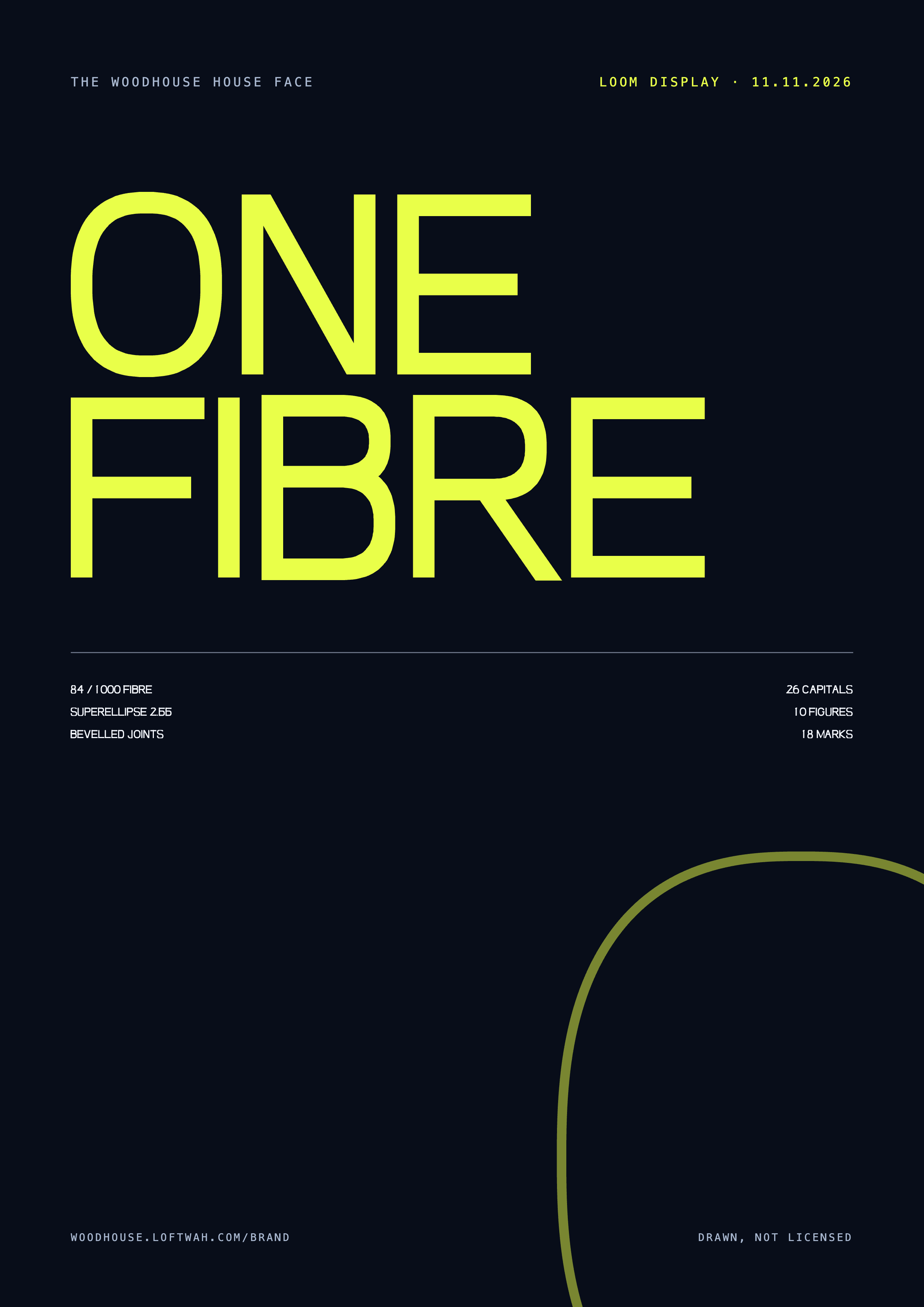
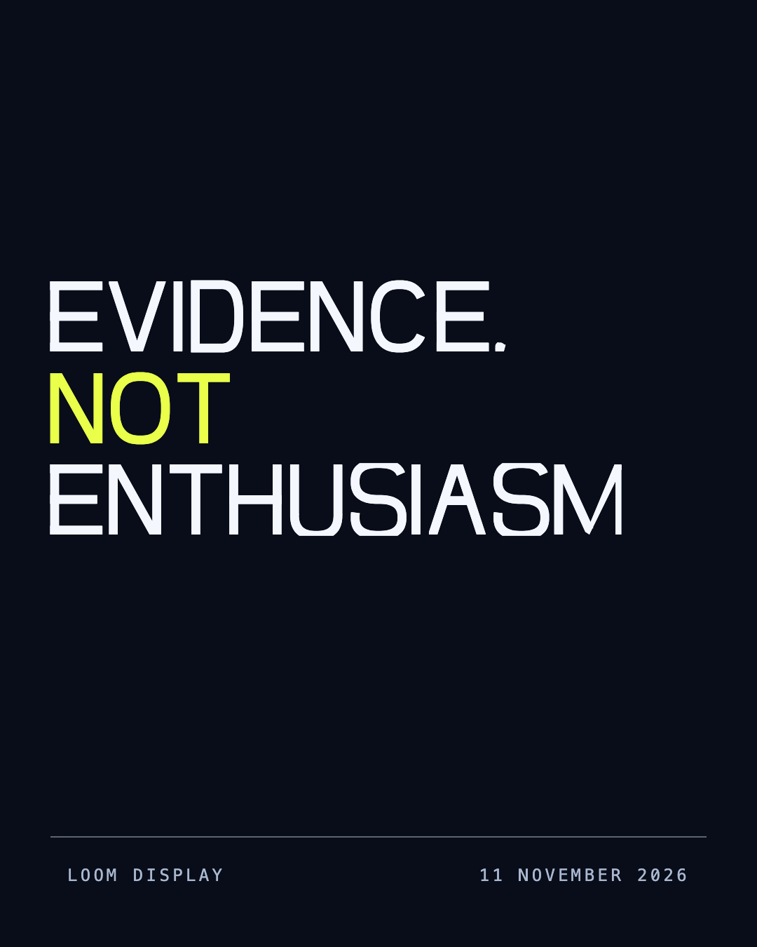
Every file here is a real download at full size, with no watermark and no account. They are generated, not hand-exported, so the next change to the face rebuilds all six.
Three motion laws
A position is a spring
A reversal follows the new intention, not the old timeline. If a visitor changes their mind halfway, the scene changes halfway.
One audio owner
One transport, one set of effects, one music bus. Sound starts on a deliberate gesture and never on load.
Reduced motion loses nothing
The springs snap, the idle movement stops, and every control, label and explanation stays exactly where it was.
Voice
- Say the number. A review date, a version, a count, a limit. If it cannot be sourced, it does not go in the sentence.
- Name the failure before the fix. What broke, who it affected, what it cost, then what changed.
- Delete the adjective you would not defend in a room. "Robust", "seamless" and "powerful" are the first three.
- Sentence case for prose, uppercase for short labels. Never a paragraph in capitals.
- Put the limitation beside the claim it limits, not in a footnote that the reader will never reach.
The longer version, with the editing routine, is inUNSLOP.md.
Take it
The binaries are the drawing, not a picture of it. Both are generated byscripts/brand/loom-font.py, so the source of truth is a file in the repository and not an export someone has to remember to refresh.
- loom-display.woff24.9 KB · web
- loom-display.ttf14.7 KB · desktop
- woodhouse-seal.svg1 file · mark
- loom-film.mp4One fibre · 68 seconds

Released with this repository under the MIT licence. The name of the typeface and the seal are the factory's; the outlines are yours to read, learn from and use.
One fibre
Sixty-eight seconds on how the face was drawn: the stroke, the curve, the cut, and the alphabet that comes out of them. No sound, so it starts when you tell it to.
Read the film
00:00 A letter is a stroke that has been asked to hold a shape.
00:08 This is one fibre: 84 units wide, on a thousand-unit em.
00:16 It bends. A circle would be exponent two; a squircle, four. This is 2.55, so the curve has a memory of being pulled.
00:30 Where two straight strokes meet, the corner is cut. Bevel, never miter. The letter is fabricated.
00:44 Twenty-six of those decisions, then the figures, then the marks a headline needs.
00:58 Loom Display. Drawn for Woodhouse, 11 November 2026.
What is decided, and what is not
Decided 11 November 2026: the face, its four laws, the seal's construction, the palette's six jobs and the two-display-face split.
Not decided: nothing on this page changes an existing page's typography. The site keeps Bricolage for editorial headlines, as directed on 10 November. Share cards still set their project names in Bricolage until that renderer is re-checked with Loom in it.
Reviewed 11 November 2026. A passing build is not a reader's acceptance, and this page is a reading of the design rather than the design itself.